[ PROJECT OVERVIEW ]
The Product : This website focuses to enjoy buying a flower bouquet from a local flower shop as a gift or for daily use.
The Problem : During pandemics, people have started to stay and work from home. It is difficult to go out and give a gift to friends. People desire to have plants or natural items. Also, the flower shop wants to start an online shop for them and make an easy simple purchase flow.
The goal : Make an easy and simple purchase flow for people who want to purchase a flower as a gift or for daily use. Additionally, try to consider the eco-friendly system.
[ UNDERSTANDING THE USERS ]
User Research Summary : I conducted user interviews, which I then turned into empathy maps to better understand the target users and their needs. I discovered that many target users want to have a flower shop staff recommendation, probably because users don’t have much knowledge about flowers. However, online flower shops are not well designed in recommendation features.
Persona 01: Lulu Wong
Lulu Wong is a tired businesswoman who needs to make her room feel refreshed and nice because she has started working from home. She to try a flower delivery subscription service. But she is not sure that she likes the subscription service. It will be good to have one-time purchase to check and see if she likes this flower shop or not before she starts the subscription service.

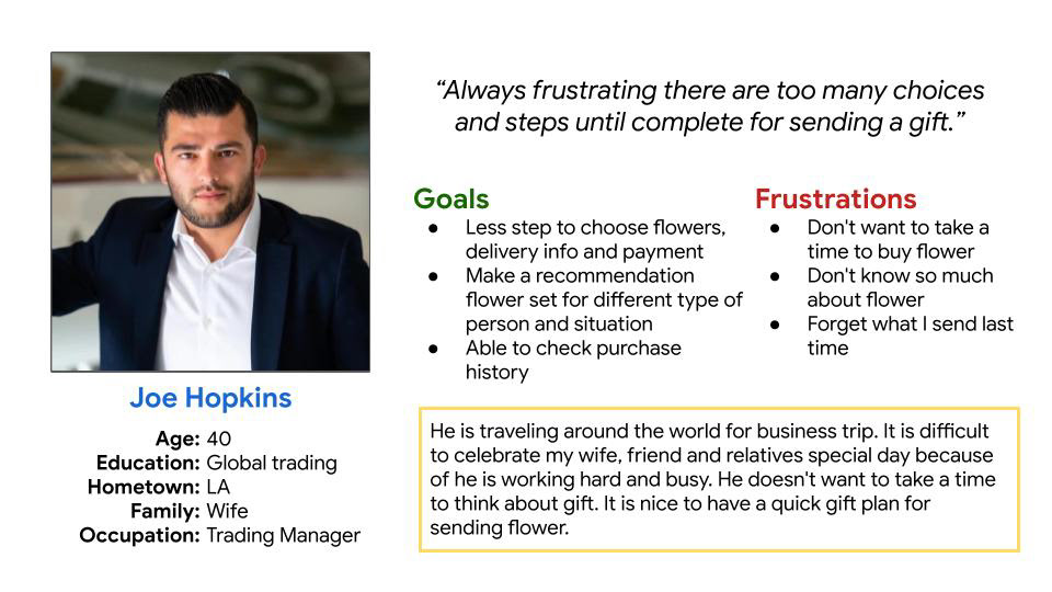
Persona 02 : Joe Hopkins
Joe Hopkins is a busy businessman who needs to have a purchase history because he doesn’t want to send some flowers again, and also keep track of the receiver’s favorite flowers. He wants to send a bouquet for his wife's birthday. But he was irritated during the process because there are too many bouquet options to choose from and too many places he has to type in his information.
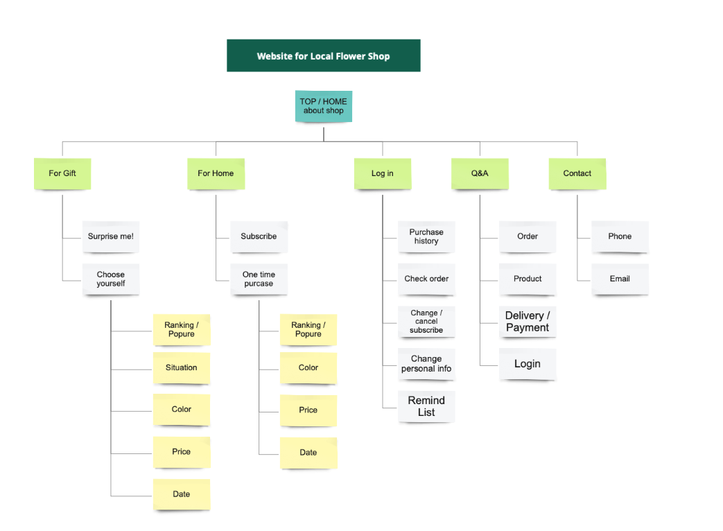
[ STARTING THE DESIGN ]
Site Map
In many cases, people are frustrated at complicated steps of purchase flow. My goal is to create a system to easily choose and buy.
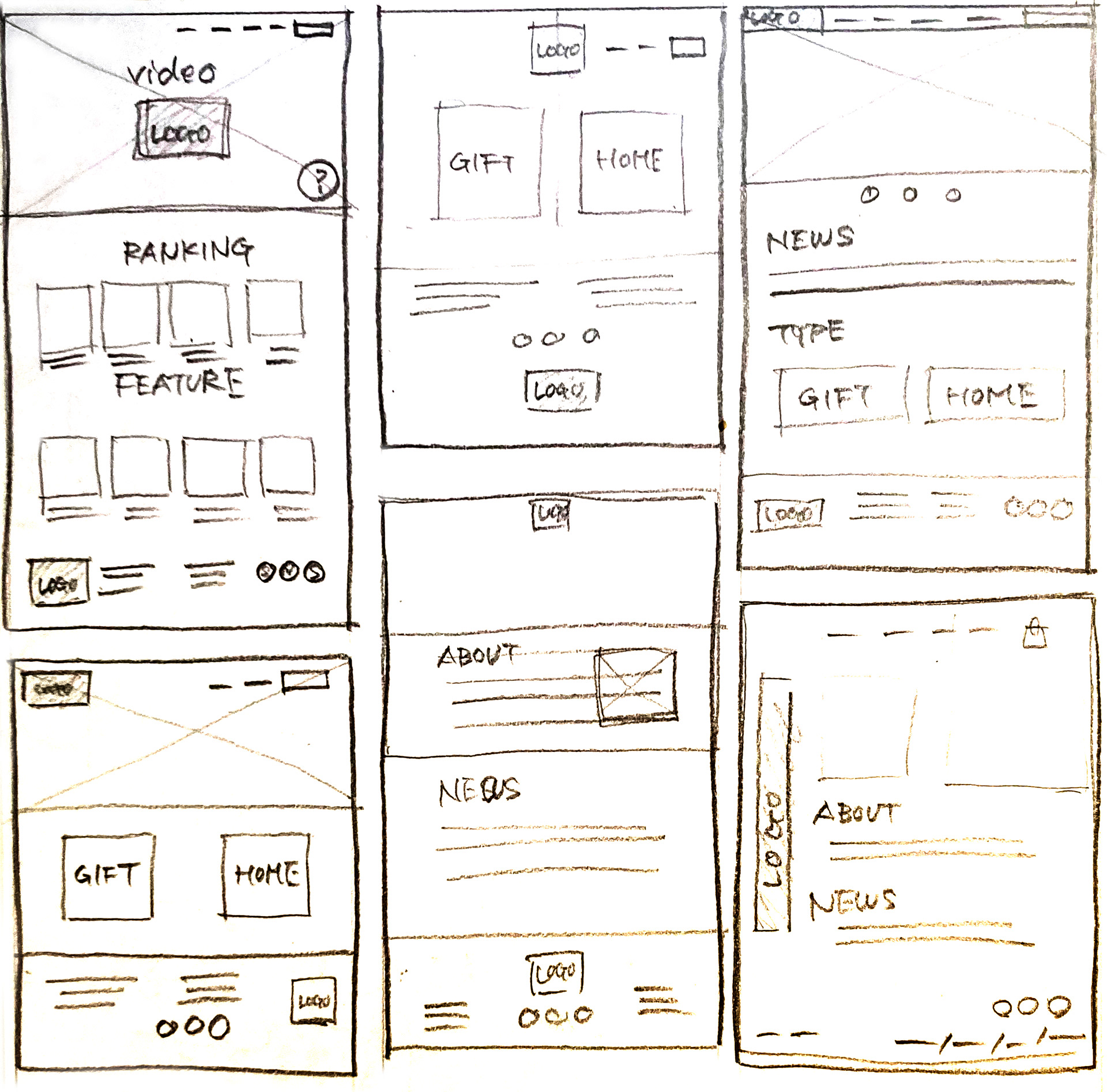
Paper wireframes
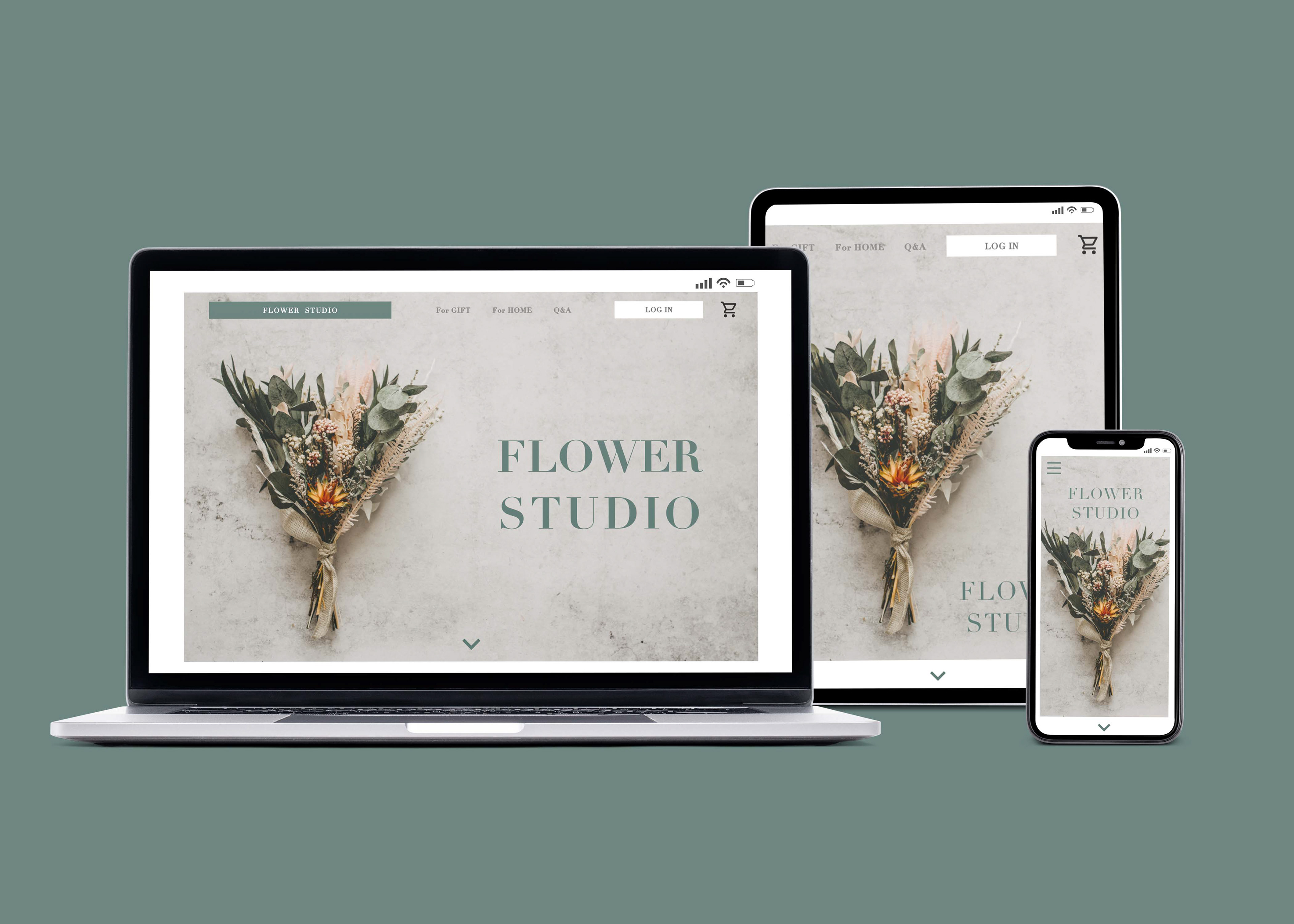
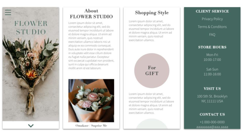
Next, I sketched out paper wireframes for a website's top page. I prefer to have a huge beautiful flower photo on top and show different styles of bouquets. Also, the high-quality photos make users feel excited to see more beautiful photos and enjoy shopping.
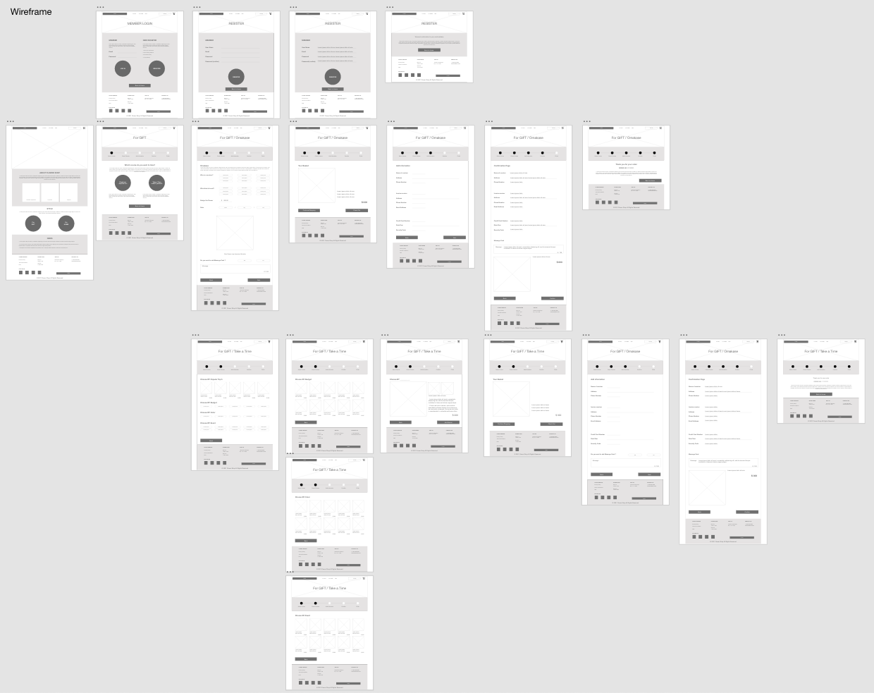
Low-fidelity Prototype
To create a low fidelity prototype, I connected all of the screens involved on the primary user flow of adding an item to the cart and checking out.
[ REFINING THE DESIGN ]
High-fidelity Prototype
My hi-fi prototype followed the same user flow as the lo-fi one and included the design change made after the usability test.
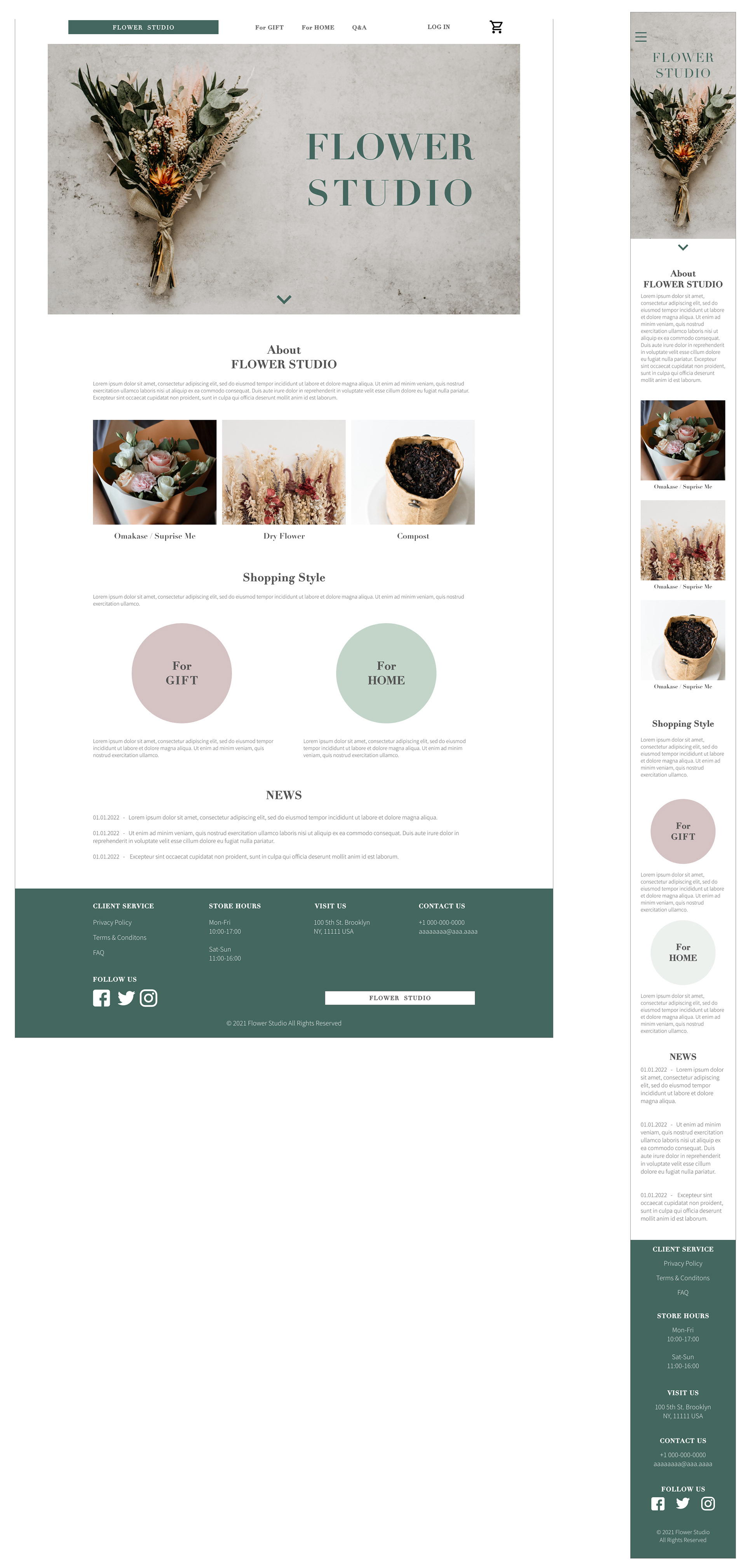
Desktop & Mobile Main Page / High-fidelity

Desktop / High-fidelity
Mobile / High-fidelity
[ GOING FORWARD ]
Impact : The purchase flow was almost the same as other conventional shopping websites. So there are not so many differences. But I focused on two alternative ways for users to reach what they want.
What I learned: I refined the text size, scale of photo and spacing, since they were too big and the pages appear a bit empty. I needed to resize and find a good size for a visually pleasing website.